Google’s New Gradient G Logo After a Decade – The Iconic Symbol
Published: May 17, 2025
After nearly 10 years of staying the same, Google’s New Gradient G Logo, a fresh look with same colors.
While at first it might seem like a small design change, it actually represents a bigger shift in Google’s branding and vision for the future.
Let’s walk you through what changed, why it’s important, and how it ties into Google’s growing focus on AI, design, and user experience.
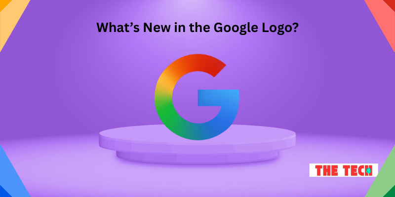
What’s New in the Google Logo?

The classic Google ‘G’ logo, the one we see on apps like Google Search, Gmail, and Drive, has received a gradient color update.
Instead of four solid color blocks—blue, red, yellow, and green—the new design now blends those colors into a smooth gradient.
This updated Google app icon is already live on the iOS Google Search app, and is slowly rolling out on Android (starting with version 16.18 beta).
That means, over the next few weeks, you’ll likely see it appear on your device too.
It may seem like a small visual tweak, but in the digital world—where icons are instantly recognizable and used billions of times a day—even the tiniest change can make a big difference in how a brand feels.
Why Did Google Change the Logo Now?
You might be wondering: Why fix something that wasn’t broken?
Well, there are actually a few good reasons:
- Keeping Up with Design Trends: Flat designs are being replaced by gradient and 3D-style visuals, which feel more modern and alive.
- Better Visual Consistency: The new style matches Google’s current approach seen in products like Google Gemini, making the experience feel more connected.
- Adaptability Across Devices: With so many types of screens now—smartphones, tablets, foldables, wearables, and even cars—this new logo scales better and looks cleaner everywhere.
In short, it’s a future-proof update that helps Google stay fresh while aligning with where tech is heading.
The AI Connection: Matching Google Gemini’s Vibe
There’s a smart reason behind the new gradient style. It’s not just about looks—it’s a branding decision tied directly to Google’s AI strategy.
The color scheme and soft edges of the logo look very similar to Google Gemini’s design language, which is the company’s flagship AI assistant.
By unifying the design of the logo with its AI product, Google is clearly telling users:
AI is now a core part of what we do.
This new visual identity will make it easier for users to recognize anything related to Google’s AI tools, whether they’re using them on Android, desktop, or voice-enabled devices like Pixel phones or Nest Hubs.
Hidden Details You Missed
Beyond the surface-level update, here are some interesting details that many people—and even some tech websites—may have overlooked:
- Golden Ratio Design: The new logo follows the Golden Ratio, a mathematical formula often used in nature and art for creating balanced and visually pleasing shapes. It gives the logo a more natural and professional look, even if you don’t consciously notice it.
- Designed for All Screen Sizes: Unlike the old logo, the new gradient G renders better on all screen types, especially high-resolution displays, folding screens, and smaller wearable devices. This is crucial in today’s world where people use devices of all shapes and sizes.
- A Nod to AI-Powered Branding: By aligning the logo with AI-driven tools like Gemini, Google is clearly moving toward a more unified branding system where everything AI-related looks and feels familiar.
- Perfect Timing: Just Before Google I/O 2025: The update came right before Google I/O, the company’s biggest annual developer event. That’s often where major new AI features, product launches, and system updates are announced. So this redesign could be the first hint of bigger changes coming soon.
Will Other Google Icons Get a Makeover Too?
Design experts believe this update may be just the beginning.
Many are speculating that this new Google ‘G’ logo redesign might be followed by similar updates to other popular Google apps like:
- Chrome
- Gmail
- Google Maps
- Google Drive
If true, it would help create a cohesive and polished look across the entire Google ecosystem.
Just like how Apple apps all follow a unified design theme, Google may now be doing the same—especially in a time when AI features are being added to almost every product.
How the Internet Reacted
As expected, the internet had mixed feelings. Some users were quick to say,
“I didn’t even notice until someone pointed it out!”
While others took to X (formerly Twitter), Reddit, and design forums to share side-by-side comparisons, zoom in on the changes, and even make jokes and memes about how “subtle” it is.
It’s a fun reminder that even the smallest design tweak can stir big reactions, especially when it involves a brand as globally recognized as Google.
Final Thoughts: More Than Just a Logo
At the end of the day, this update is about more than just colors or shapes.
It’s a signal from Google that the company is entering a new phase—one that’s driven by AI, enhanced user experience, and flexible design for the devices of tomorrow.
So next time you tap that “G” icon on your phone, know that it’s not just a shortcut to search—it’s a preview of where Google is headed.
FAQs
Google’s iconic ‘G’ logo has received a visual refresh for the first time in nearly a decade. Instead of four solid blocks of color, the new version uses a gradient that smoothly blends blue, red, yellow, and green. This gives the logo a softer, more modern, and dynamic look. It’s a small but significant update that reflects current design trends.
Google introduced the redesign to align with its growing focus on artificial intelligence and evolving product design. The gradient style matches the branding of new AI tools like Google Gemini. It also creates a more consistent visual identity across apps and devices. This timing also aligns with recent announcements and branding shifts ahead of major tech events.
You can already spot the updated logo on the Google Search app for iOS. Android users will begin to see it soon, starting with version 16.18 (beta). It’s expected to roll out gradually to other apps and platforms over the next few weeks. Keep an eye on app updates to see the new design appear.
While Google hasn’t confirmed anything officially, many experts believe that other app icons like Chrome, Gmail, and Maps might also get similar gradient redesigns. This would help create a more unified and modern visual language across all Google products. The gradient style fits well with Google’s broader AI branding strategy. So more updates may be on the way soon.
Reactions have been a mix of curiosity, humor, and surprise. Some users barely noticed the change until it was pointed out, while others appreciated the sleek, updated look. Many took to social media to compare the old and new versions with memes and side-by-side images. Overall, it’s a subtle shift that has sparked a big conversation.
Bonus Info Points that You Should Know
- It’s Not Just Cosmetic – It’s Branding Evolution: The gradient design isn’t just about looks — it reflects how Google is repositioning itself in the AI era. The smoother transitions between colors symbolize how seamlessly its apps and services are being integrated with artificial intelligence, particularly the Gemini AI assistant.
- Designed for Dark Mode & High-Res Screens: This new logo version is more optimized for dark themes and high-resolution displays. The gradient pops better on OLED and Retina screens, making it look sharper and more polished in various lighting environments — especially in dark mode, which many users prefer today.
- It Signals a Broader Visual Language Shift: Experts believe this might be the start of a new wave of Google product icon redesigns. A more fluid and consistent visual style across all Google apps could improve brand recognition and usability — especially for users navigating on mobile or wearables.
- Beta Rollout Strategy Reveals User Testing: Google first released the logo in beta versions of apps before rolling it out widely. This allows them to test how users respond before making it a default design, showing how even minor design changes are carefully A/B tested at scale.
- Inspired by Google’s AI-First Design Philosophy: The gradient aligns with Google’s shift to an “AI-first” company. You’ll notice the same soft gradient theme appearing in Gemini, Bard, and other upcoming AI tools, creating a unified look that blends design with purpose.

- Be Respectful
- Stay Relevant
- Stay Positive
- True Feedback
- Encourage Discussion
- Avoid Spamming
- No Fake News
- Don't Copy-Paste
- No Personal Attacks


- Be Respectful
- Stay Relevant
- Stay Positive
- True Feedback
- Encourage Discussion
- Avoid Spamming
- No Fake News
- Don't Copy-Paste
- No Personal Attacks


